As I started to think how should look my blog I've stopped at idea of colors. And there it is! One of most serious steps by designing every marketing idea - would I mention business card, image ad on magazine or even rockstar's outfit.Before I modeling any of my promotion ideas I play the role of lab's rabbit and test them on my own.
Regarding to my blog, my idea is to share my ideas at first. I highlight as main content each post of mine. They must have priority #1. Posts need to have good visibility and main blog screen should not bother one's eyes. I have chosen to set background of dark-aquamarine. This color have value for centuries - remember old versions of Windows Default [None] desktop? My eyes felt perfectly, no flickering, no snow-blindness, and I also can find every folder without problems on my desktop. So, the same must be here.
Every color has their message and stereotypes. Black is power and strength, white - purity, red - attention, green - nature and money, yellow - sun and good life, purple - majesty and prestige, and so on. They make emotions. They have power. Because people, those who don't use LSD, see them, not hear them.
PEOPLE SEE COLOR NOT MESSAGE FIRST!
If you don't believe me try this KIDDY TEST.
So, if your drugstore or wedding chapel bankrupted, try to remember- wasn't it's title coloured on dark black, haha.
Of course there are also color mixing and a lot of people want to know what is the most powerful and best color mix. Wise people says that's Yellow on Black or White on Red, and that may seems to be true. But again - it carries a message on colors and if every advertisement will be like this, then it could bring us to Poland where 95 per cent of ads look like this:

So maybe it is time to highlight ourselves, huh?
There is one tool that can be effective for web developers as well as for advertising copywriters. You can find it HERE. That is good for shading and also for contrasting message.
We shouldn't forget that by mixing the colours we can easily disrupt each specific color signal. For example if mixing
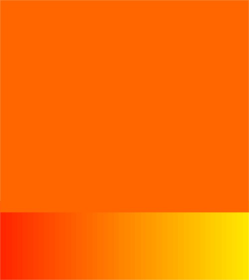
Orange (that is sign for warm,sunny and even juicy emotions)
with

Black (Power, stability, strength, etc.)
we may get something like this:
Looking at last one I feel something between rotten orange and arson. Nothing good at all, despite the fact that each specific color carries positive and strong emotions.
At conclusion I may say that there are no formulas which guarantees you the best color or mix - you just need to search for color meanings, color types (cool, warm, neutral, mixed) and carefully study them. you can use this source, that has been quite useful for me: COLOR SIMBOLISM.
And keep general principle - test everything on yourselves.
But as this is quite interesting section in marketing I am sure that I will get back at this topic to get more deeply in it.
No comments:
Post a Comment